

The ElementalTV
Brand
ElementalTV’s brand refresh marks a bold new chapter in how we power the future of CTV. With a sharper voice, a cleaner look, and a renewed commitment to putting publishers first, we're redefining what CTV monetization should feel like - simple and transparent, with a touch of disruption.


1Audience
Meet 1Audience, our flagship audience intelligence platform designed for a new era of audience-first media buying. With the aperture icon as its visual core, 1Audience is all about precision and granularity. We bring fragmented, raw viewer data into focus, turning it into actionable, high-performing audience segments. This isn’t just about targeting; it’s about data with intent. With 1Audience, advertisers and publishers are finally able to see eye to eye.


Granular, precision-driven, and data-activated audiences.

Typography
Typography is our visual voice, bringing range, nuance, and attitude to what we have to say.
Headline Font: Inter
Paragraph Font: Europa
Misc: Cabin

Our Colors
Our renewed color palette strikes a balance between clarity and edge. It’s grounded in black and white for sharpness and simplicity, while bold accents of green and purple add energy and forward momentum. Together, these colors reflect a brand that’s both simple and unapologetically future-facing.
Vibrant Green
#57d993
Pure Black
#000
Purple
#9b36af
Dark Grey
#616363
Pure White
#fff

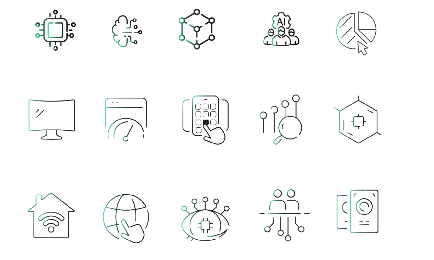
Iconography
Icons are part our emotive and navigational language. They also bring attitude and texture to our stories. The displayed icons should always be a contrasting color.
Logo Usage
The ElementalTV and 1Audience logos should only appear in black or white. They should never be altered with other colors, gradients, or image fills.
When placing the logo over images or colorful backgrounds, ensure there is sufficient contrast and that the logo remains clearly legible, with minimal visual interference from the image content.

